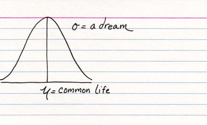
Actually the circly thing is the standard deviation (variance would be squared) and the more standard deviations you get from the mean, the less likely it is that the something will happen. And the mathletes giggle.
This site is a little project that lets me make fun of some things and sense of others.
I use it to think a little more relationally without resorting to doing actual math.


8 comments:
very nice
haha.
i do not understand mathmatics much;
but i definatly can understand this!
Beautiful. On the other hand it looks like a drawing of upside down buttcheeks. What's with that?
2 words
Your Awesome!
Red
Awesome blogging idea. Very very interesting.
A rather belated congratulations on being announced a 'blog of note'. But here is one anyway. A congratulations, I mean.
Very well deserved.
I think I didn't quite get it. Could anyone explain?
(I'm just an ignorant French, but I love this blog).
your masterpiece
Actually the circly thing is the standard deviation (variance would be squared) and the more standard deviations you get from the mean, the less likely it is that the something will happen. And the mathletes giggle.
Post a Comment